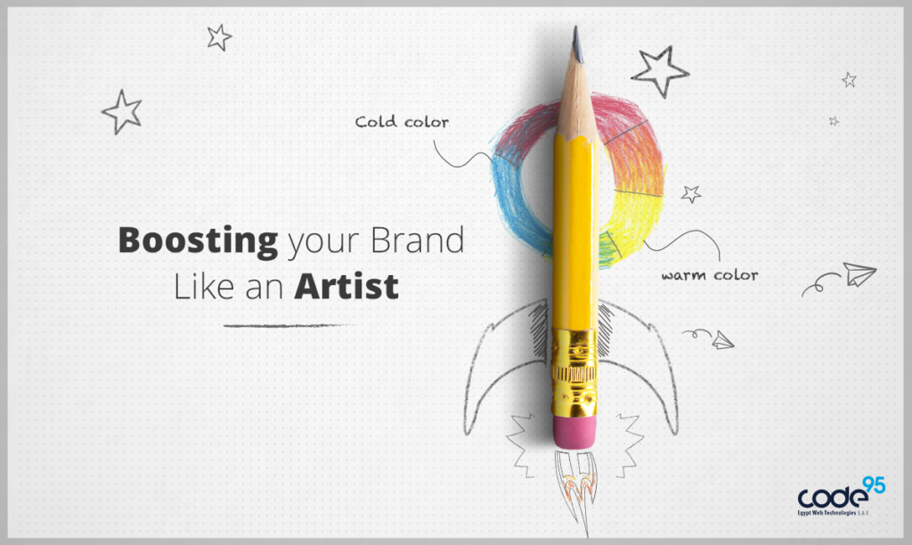
Boosting your brand like an Artist
Created: 27 Jul, 2017
Last Edit: 03 Oct, 2024
It's proven from the dawn of time that people love things which make them feel like they belong to, things that relevant to their life, things that expresses their personality and lifestyle.
In Code95 boosting brand perfectly is what it works on exploring peoples' minds and satisfying their brains by getting into their taste straight to the level where they be the most influencer and controller to what they prefer.
“Branding is about signals–the signals people use to determine what you stand for as a brand. Signals create associations.” –Allen Adamson
But how to get this job done and make your brand rock, slaying all competitors in style !
1. Differentiation: What makes your brand unique.
2. Relevance: How this difference is appropriate to the people you are willing to target.
3. Esteem: How your brand is well regarded in the marketplace.
4. Knowledge: How your targeted audience are willing to understand your brand.
We also think that one of the most cited tools used for boosting brand perfectly and attracting peoples' attention is Visuals , and what makes visuals really attractive are colors.
Studying the psychology of colors is very important before creating your brand or establishing your website design. Studies has showed that it takes 7 seconds for customers in order to form an opinion or a first impression.
Just think of it, Only 7 seconds!! can decide the fate of your brand whether it's yay or nay.
How colors touches our emotions?
Every color in general plays a certain role in boosting brand perfectly and affecting customers' emotions, their moods and how they will receive the exact message that the brand is trying to send to their brains.
for Example:
Blue, is a calm and smooth color and also it's a sign of stability, depth, wisdom and loyalty.
Brands like: Facebook, PayPal, IBM and for sure Code95 have used the color blue in their brands because it describes trustworthiness.
it's like saying " Hey man! just chill out and have some trust in what i offer you"
Red, is well known that it's the most warm and dynamic color, it affects our emotions, representing passion, anger, love and danger.
Brands like Cocacola, Virgin and Pinterest have used the color red as it describes Excitement Energy, positive vibes and inspiration.
Using the red color in your brand will surly draw attention , but much of it might be overwhelming.
Also colors like:
Yellow : Optimism
Purple : Creativity
Orange: Friendly
Green: Peacefulness
How can we choose the right color for our brand ?
It mainly depends on choosing the right way, the right time, the right audience and the right purpose.
So if you are selling kids toys for example, kids won't love to see black and white for sure, so fun and vibrant colors like bright green or neon orange will attract kids' attention and their parents too and so that boost sales.

And that's how it goes with females and males too, Studies has shown that females most favorite color is blue, then after that comes purple and green and their least favorite is orange, brown and grey!
For males, they prefer black , green and blue and they dislike colors like brown, orange , purple and yellow.
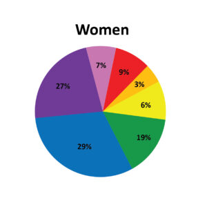
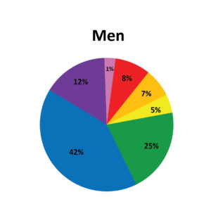
So knowing this science will help you adding a lot of harmony while creating a website or a brand according to the audience that you're targeting and show that your business is genuine.
Created: 27 Jul, 2017
Last Edit: 03 Oct, 2024
Read Also
Website Development Cost in Egypt – Plan Your Budget
خطوات كتابة محتوى تسويقي ناجح
مميزات المنصات الإلكترونية
7 key elements to include in your company profile to win more leads
The secrets of a successful lead generation landing page!
